
CSS Grid: Template Areas
Template Areas
CSS Grid Layout has been a gamechanger for me, it’s simple, quick, very effective, and supported by all major browsers. So, I thought I’d write a quick guide showing how easy it is to setup a standard page using grids, particularly grid template areas.
Firstly though, browser support:
| Chrome - | Firefox - | Edge - | Safari - | IE 11 |
|---|---|---|---|---|
| 57 | 52 | 16 | 10 | 😕 |
While you can add IE compatibility through some polyfills, I won’t be going into that for this post.
What is CSS Grid Layout?
Before I get into the specifics of template areas, here’s a quick overview of CSS Grid from w3schools: “The CSS Grid Layout Module offers a grid-based layout system, with rows and columns, making it easier to design web pages without having to use floats and positioning.”
Here’s an example of a basic 2x2 grid layout:
<style>
    .container {
        display: grid;
        grid-template-rows: 1fr 1fr;
        grid-template-columns: 1fr 1fr;
        height: 200px;
        width: 200px;
    }
    .container div {
        border: 1px solid red;

    }
</style>
<div class="container">
    <div>
        #1
    </div>
    <div>
        #2
    </div>
    <div>
        #3
    </div>
    <div>
        #4
    </div>
</div>
That, creates this:
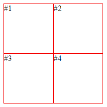 Easy!
Easy!
Standard Web Layout
When using Template Areas for more complex pages this syntax becomes even easier to understand in my opinion; I personally like the visual aspect of seeing named areas rather than the usual grid-row: 1 / span 2 etc. syntax
So, here’s the layout I’m going to be creating:
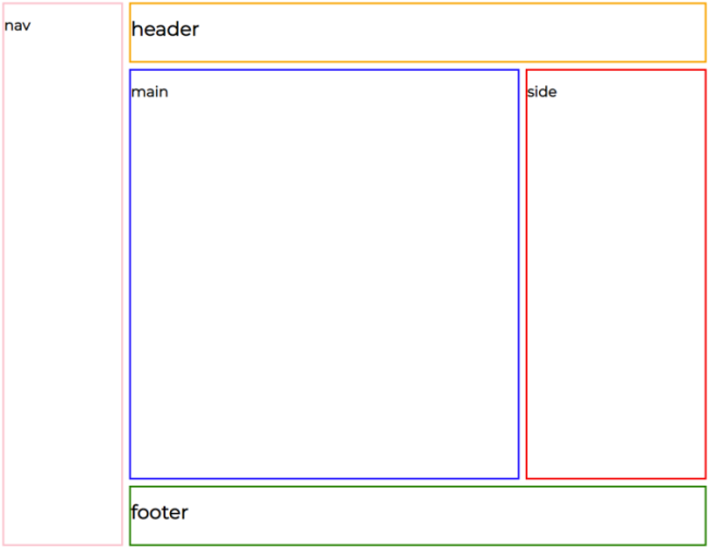
You can see this is split into 5 main sections: Nav, Header, Main, Side, and Footer. I’d say this is typical of a website layout and one that could be awkward to implement using the usual CSS tricks.
This is how simple it is with CSS Grid & Template Areas:
<style>
    .container {
        display: grid;

        grid-template-rows: 100px 1fr 100px;
        grid-template-columns: 200px 1fr 300px;
        grid-template-areas: "nav header header"
                             "nav main side"
                             "nav footer footer";

        grid-gap: 10px;
    }

    nav {
        grid-area: nav;
    }

    header {
        grid-area: header;
    }

    article {
        grid-area: main;
    }

    aside {
        grid-area: side;
    }

    footer {
        grid-area: footer;
    }
</style>

<div class="container">
    <nav> nav </nav>
    <header> header </header>
    <article> main </article>
    <aside> side </aside>
    <footer> footer </footer>
</div>
Let’s break the CSS down, the first line display: grid; tells the browser that this div and its children will be using a grid layout (specifically a block level grid). Next, we have the grid definition which can be split into two parts: defining the row and column sizes and, defining the grid areas.
Looking at the row and column definitions:
    grid-template-rows: 100px 1fr 100px;
    grid-template-columns: 200px 1fr 300px;
This is creating 3 rows and 3 columns, all different sizes. By using 1fr we’re telling the browser that this row/column should take up 1 fraction of the remaining space; in this case that would be all remaining space. If we had defined a row 1fr 1fr 1fr it would create 3 evenly distributed rows.
Next, the template area definition:
    grid-template-areas: "nav header header"
                         "nav main side"
                         "nav footer footer";
This is visually mapping where each section of our page will fit in the previously defined grid. Each string is a single row; the first row "nav header header" is stating that the first column will be taken by the nav area and the last two columns will be used by the header area, the second row being "nav main side" is stating that the nav area will continue to the second row and the main and side areas will take up one cell each.
I’ve chucked a grid-gap: 10px; in there to help with the layout, this just adds some space between each cell.
Lastly, we assign our items on our page to the grid areas using the grid-area: <name> property.
    article {
        grid-area: main;
    }
And with a little extra work you can start populating the page with your page information.
Responsive design
Just a little side note here: CSS Grid is responsive! With a few media tags you can adjust the number of columns/rows and create a nice mobile friendly layout, for example:
.container {
    display: grid;
    height: 90%;
    grid-template-rows: 100px 100px 1fr 200px 100px;
    grid-template-columns: 1fr;
    grid-template-areas: "nav" "header" "main" "side" "footer";
}

@media (min-width: 768px) {
    .container {
        grid-template-rows: 100px 1fr 100px;
        grid-template-columns: 200px 1fr 300px;
        grid-template-areas: "nav header header" "nav main side" "nav footer footer";
        grid-gap: 10px;
    }
}
Go and play!
While I haven’t gone into great detail regarding CSS Grid and all of its possibilities, I hope this has been helpful in showing you just how much it can help you when designing a web page and motivated you to start using CSS grid. Once I’ve got to grips with the polfills to support IE 11 🙄, I will be using this a lot more.
If you want to learn more about CSS Grid, and what it can do for you, I’d recommened looking here.